Accessibility: a Neglected Aspect of Web Application Development
15.12.2023
Background
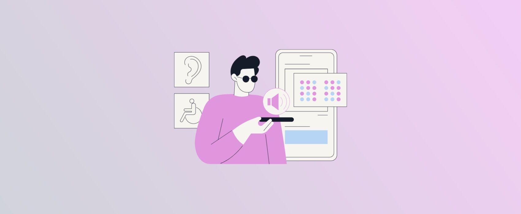
Most of us have had bad experiences on websites on multiple accessibility issues. Did this contact form send my message or did it just fail silently? Why is this form not submitting when I am pressing the Enter key? These are just scratching the surface of the multitude of issues that users face. Once bad accessibility enters into play when the user has some sort of impairment, the lack of accessibility can even render the application unusable. Read on to learn more about web accessibility.
What is web accessibility? W3.org defines web accessibility as follows: “Web accessibility means that websites, tools, and technologies are designed and developed so that people with disabilities can use them.”
W3.org also lists benefits for people without disabilities such as:
- people using different devices with different input modes
- older people with changing abilities
- people with temporary disabilities such as affected hearing
- people with situational limitations such as using a device in direct sunlight or loud environments where audio can’t be heard
- people having slow internet connection due to bad signal or too high cost
One important factor to consider with accessibility is regulation. For example, the European Accessibility Act is implemented in Finland by the Law “Laki digitaalisten palvelujen tarjoamisesta”. Finnish law implementing the European directive mandates that the public sector, and some of the third sector and private sector, must be compliant with accessibility requirements like A and AA criteria of the Web Content Accessibility Guidelines (WCAG). You can read more on the regulation from the site provided by Finnish authorities.
In the following chapters, we are going to cover some important topics related to accessibility criteria and tools to verify website accessibility.
Websites Should Be Usable With a Keyboard
Users with motor impairments may have to rely on using a keyboard to navigate web pages rather than using a mouse. Thus, web pages should be designed to accommodate users who rely solely on a keyboard as their input device. WebAIM accessibility checklist states that all page functionality should be available with a keyboard. WebAIM checklist is based on Web Content Accessibility Guidelines (WCAG).
One important aspect of keyboard usage is focus. Focus determines where keyboard events go on the page. For example, if you are focused on an input field and write your name, the input field receives the characters and they are also shown on the display. Focus should also be visually emphasized. In the following image you can see that the “Full Name” input field is focused with a blue border.
You can try an interesting demo which has the mouse control is disabled and you have to rely on the keyboard to fill in the fields. You can use Tab and Shift + Tab to navigate between elements. Once you reach the radio button group, you can use arrow keys to choose. Once you reach the destination select element, you can type to see the autocomplete values. Promotional offers can be disabled with a space bar click. Enter can be pressed to submit the form.
Websites Should Be Usable With a Screen Reader
Screen readers are software programs used by blind or visually impaired users to read text on a screen. Users send commands by using a keyboard or by a braille display. A Braille display can generate braille characters, raised dots in a 3×2 configuration, for users to read the text with their fingertips or input characters of their own.
Making a site usable with a keyboard is a good first step to start testing it with a screen reader. Examples of popular screen readers include VoiceOver which is included with Macs, and NVDA which can be downloaded for Windows. You check out a video on how to use VoiceOver and a video on how to use NVDA. How to use screen readers is a very lengthy topic worthy of another blog post so if you are interested, it is best to watch the videos to learn more.
Common Accessibility Issues
Developers easily stumble on basic accessibility principles of website development due to lack of knowledge. Next I will list a few common ones and how to address them.
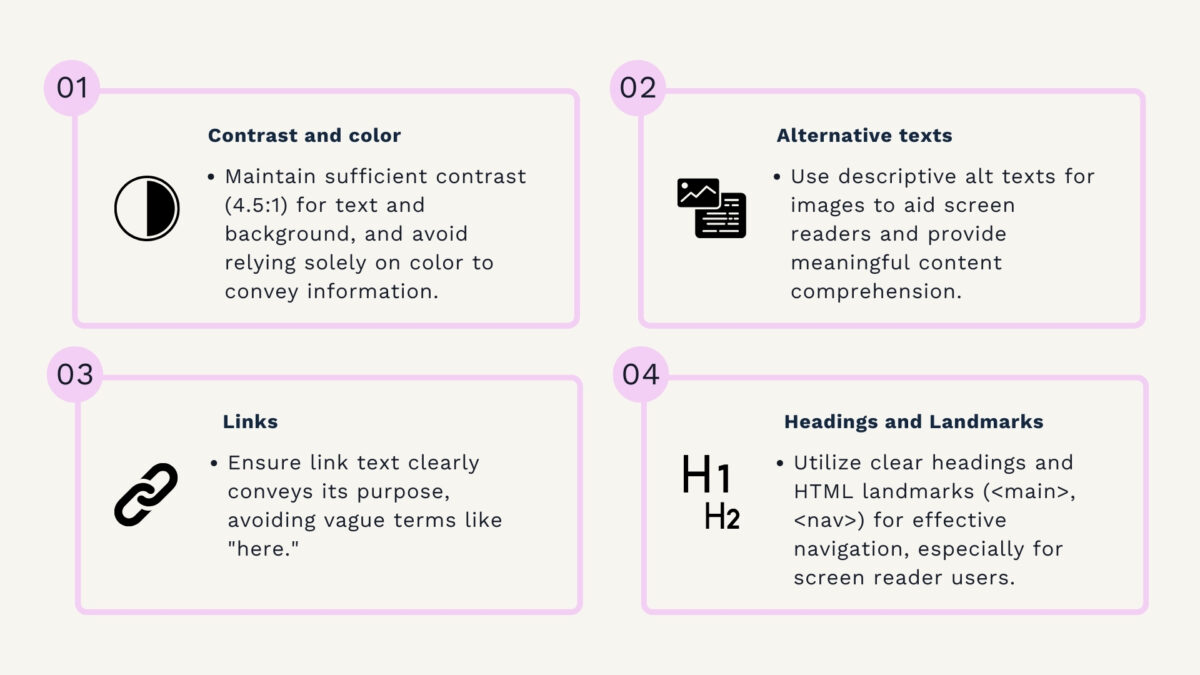
Contrast and Color
Color blindness refers to a visual condition where a person has trouble distinguishing colors. This means that most people with color blindness can see colors but have difficulties to differentiate between some colors e.g. reds and greens. Use of color is also important for the elderly, as eyesight deteriorates with age.
Contrast is an important factor for visually impaired users to be able to read text. According to WCAG 2.2, contrast ratio between the typical text and the background should be at least 4.5:1. Large scale text or text in an image can have a contrast ratio of 3:1.
Color should not be used to convey information alone. Good example of this is a form field where the user has inserted an invalid value. The form field usually is highlighted with red but this is not sufficient to convey to some color blind users that there is an error. Error text should be placed close to the form field to indicate that there is an error. This benefits both color blind and non-color blind people alike. See example image below.
Alternative texts
Alternative (alt) texts are a crucial piece for screen readers to convey information about the image to the user. Alt texts are also used by browsers as a placeholder if the image can not be displayed due to download error or some other reason.
Let’s look at a simple HTML <img> tag example containing an alt text: <img src=”https://somehostingservice.com/images/123.jpg” alt=”Finnish forest scenery”>. The alt text is shown if the image does not load for some reason. In the case of the screen reader, it can now read the text “Finnish forest scenery”. If alt text is not provided, the screen reader will read the src attribute, which in many cases is not descriptive, and is confusing for the user.
Links
W3.org WCAG specification states that the purpose of each link must be determinable from the link text. This means that texts like “Read more about our services here” are invalid. “Here” does not inform the user nor the screen reader what the link is about. Correct way to do this would be: “Read more about our service selection”. Now it is clear from the link text that it links to a service selection.
Headings and landmarks
Headings are an important part of navigating when using screen readers. HTML landmarks like <main> and <nav> can also be used to navigate to specific content. <nav> means navigation, usually providing access to subpages of a web page, and <main> refers to the main content of the page like the contents of a blog post.
Lighthouse — an Automated Browser Tool for Accessibility Testing
Chrome provides a tool called Lighthouse to analyze performance of a web page. One area of performance is Accessibility. You can open Chrome developer tools by pressing Option + ⌘ + J on a Mac or Shift + CTRL + J on Windows. There you can see a tab called Lighthouse.
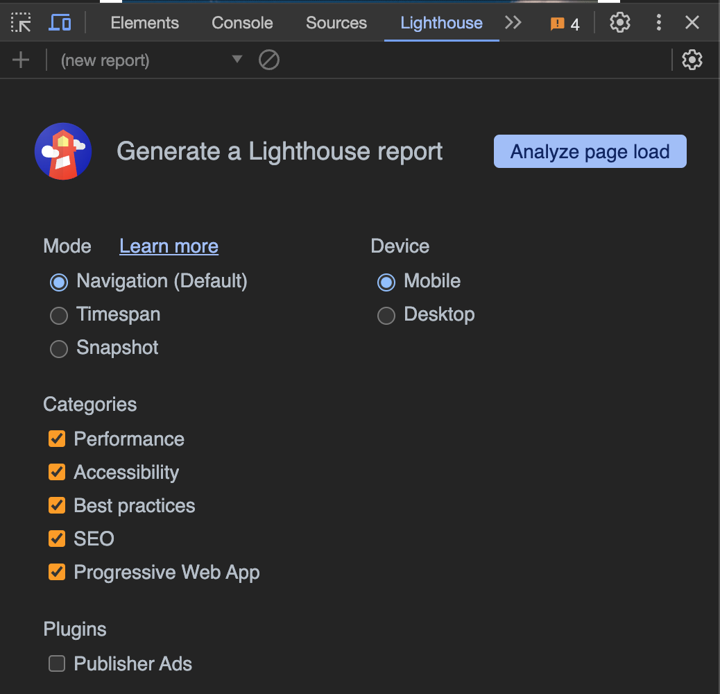
You can see that Category “Accessibility” is checked. Now you can click the “Analyze page load” button. When the analysis is done, you can click on the accessibility results to see more information.

From the accessibility view, you can see the different problems and some solutions to them.

By looking at the results, fixing them and rerunning the analysis, you can see your score improve.
It should be noted that the Lighthouse tool has some limitations. It does not test the website that it can be used with only a keyboard. Nor does it test if the site is well structured for screen readers and that the content of the alt attributes make sense for the user. For a detailed checklist for website accessibility you can use, for example, WebAIM Accessibility checklist.
But what if you want to automate accessibility checks? The axe-core library offers developers an accessibility test engine for websites, making it a valuable choice for those looking to integrate accessibility checks into continuous integration pipelines. The axe-core library is internally used by Lighthouse, so you can automate similar checks for your website.
Conclusions
Web Accessibility means that technologies, tools and websites are developed in a way that enables people with disabilities to use them. It’s important to remember that improved accessibility benefits all users, whether they’re using a device in direct sunlight or experiencing a temporarily bad internet connection. Therefore, accessibility is a key aspect of website development which is easily overlooked if developers are not informed about the resources and tools available today.
You can read more from following accessibility resources:


